Choosing colors for senior living environments requires some knowledge about how seniors see and process colors. As we age, our eyes become weaker, and our lenses thicken and develop a yellow hue. Think of this as looking through lightly amber-colored glasses. Of course, this will impact not only the ability to see lighter colors but also the ability to differentiate between certain colors. So the number one thing to consider when choosing colors for a senior living community is to ensure there is plenty of contrast between the main areas/pieces in each space. Below, we will discuss more color trends in senior living.
Colors and Mood
Every color has a generally agreed upon set of emotions that they evoke. This is a very important part of color trends in senior living because you want to create comfortable spaces that make sense. Here is a quick guide to how colors are connected to our emotions as a whole: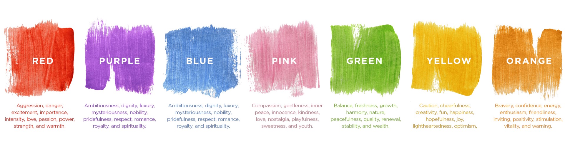
Of course, all of these colors come in different shades and hues that can completely customize a space's mood. However, keep in mind that elderly people do not see faint or pastel colors as well. It can also be a mistake to use a lot of colors that are too dark since it can make things difficult to identify for seniors. This means you should have quite a bit of contrast between the different features in each space, as well as between the areas themselves. Our next topic to think about for color trends in senior living is what colors work best for specific spaces.
Colors and Spaces
Since colors are known to evoke certain emotions and impact our subconscious in so many ways, it is important to use the right ones in the right spaces. This is especially important as you navigate color trends in senior living, as the elderly often have specific needs and conditions that can already take an emotional toll. Plus, due to vision decline in seniors, you want to make sure each area is easily distinguished from the others by color scheme. Below is a perfect, easy-to-use guide to get you started with setting up senior living spaces with the best colors.
Color Trends in Senior Living - Spaces
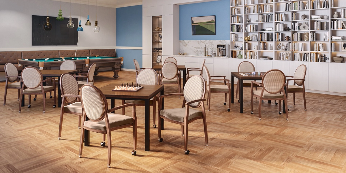
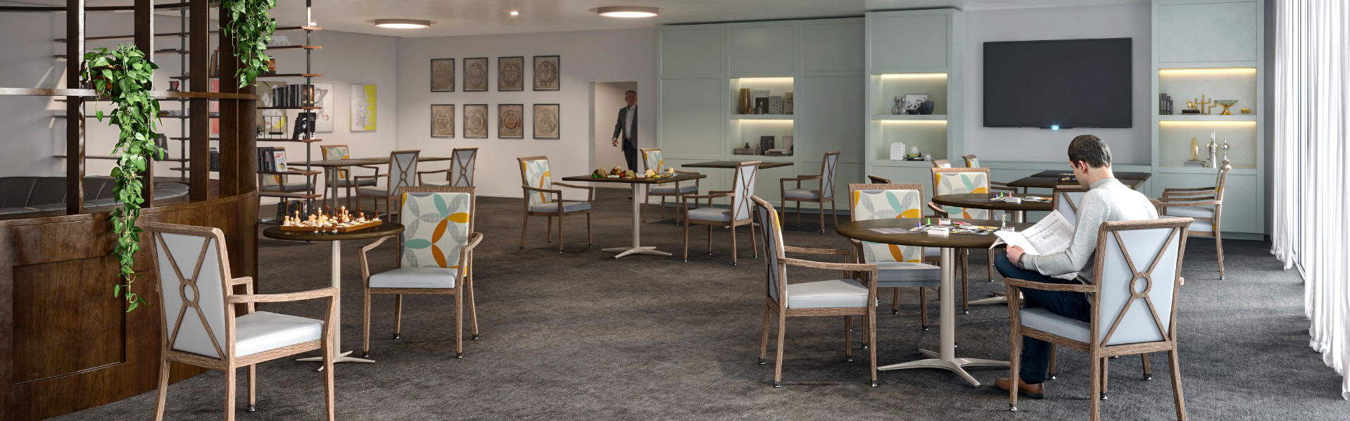 Common Areas Color Trends
These are places where you will want to promote a sense of community, warmth, and inclusion. Common areas should be well-lit (windows are a plus,) have plenty of seating, and include some places for fun activities. This makes common areas a great place to include colors like yellow, green, blue, pink, brown, and even small pops of red and purple. Just make sure all seats and tables are easy to see in comparison to rugs and wall colors. Bright contrasts with lots of natural light will make any common area a lovely place for seniors to connect and have fun.
Kitchens and Dining Areas
Food is something that brings people together and this includes seniors. However, the wrong color scheme can make food look unappetizing and discolored. This will not encourage your residents to enjoy their food, and it can even decrease their appetites over time. So, how can this be avoided? Glad you asked. The best color trends in senior living when it comes to eating areas are:
- Earthy browns and greens.
- Splashes of red or peachy pinks.
- Lots of bright light to showcase the delicious food.
Avoid a lot of blues in eating areas since this can make certain dishes look greenish or gray because of the yellowing senior's experience in their vision.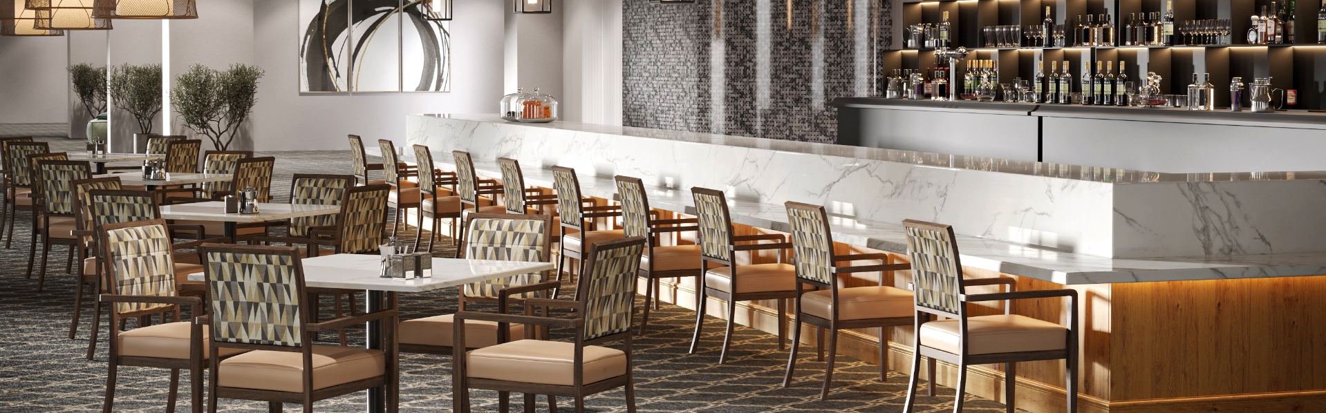
Sleeping Spaces
Sleeping spaces should be all about calmness, comfort, and relaxation. Everything from the main furniture pieces to the decor style should be centered around ensuring a restful and cozy atmosphere. However, ensure that the colors you use are not too dark and that there is an easy way to turn lights on and off. This way, seniors can easily get in and out of bed with easy access to light in order to see where they are going. (A dimmer switch or remote lighting feature here would be perfect.) To encourage a tranquil feeling in sleeping spaces, use blue tones with possibly a little bit of gray, and even some purples with soft greens and browns can work here, too.
Bathrooms
Here, you want to use a lot of light and color to differentiate between other spaces; and make sure it is easy to find and use. Older adults often need special fixtures added to bathrooms in order to make them more accessible, so make sure these are all clearly marked as well. Bright and cheerful bathrooms are easy to find, comfortable to use, and often have some themed art on the walls to break up the monotony of the space. Bathrooms should be the perfect space to utilize white with accents of yellows and pinks. Avoid reds and oranges, as these can evoke feelings of danger or warning, which can make using the bathroom feel unsettling.
Living Room/Sitting Areas
These areas should always be warm and inviting, much like common areas. However, living rooms and sitting areas in senior homes should also feel cozy and visitor-friendly for intimate gatherings with family and friends. Continue to keep good lighting in mind as well to make colors and features stand out. Seating areas, tables, entertainment centers, and more should all suit a welcoming theme as well. Make sure there is plenty of space to sit, as well as move around comfortably. An open concept is a great option here. Color schemes that do well for living rooms and sitting rooms include softer blues and purples with splashes of brighter colors like pink, green, or yellow. These colors are all warm and welcoming and bring these kinds of spaces to life.
Outdoor Spaces
Outdoor spaces are all about enjoying the beauty of nature, so be sure to consider this when deciding on decor. Whether you are a child or a senior, there's nothing like the healing power of sunshine to make you feel happy and comforted. This makes designing outdoor spaces in senior living a very important task. Elderly people need to be able to go outside and enjoy themselves, so giving them the perfect space to do so will go a long way.
Keep your color schemes here natural and complimentary to your area's natural environment. If you have lots of purple flowers growing wild where you are, consider using some yellows in your design to contrast that. Earthy colors like greens and browns are also a great base to set off just about any other bright color. Consider a more playful color scheme when designing outdoor spaces for seniors, so they can feel the excitement and energy of nature.
Conclusion
As you can see, designing spaces for Senior Living relies heavily on mindful uses of color. Since the elderly have a more difficult time identifying colors and discerning between certain colors, it is vital to cater to this in the colors you choose. In addition to this consideration, it's also important to think about the different emotions colors can make us feel.
Whether we realize it or not, the use of color greatly impacts our subconscious, which means certain colors will make us feel a specific way without us even thinking about it. Making sure to create atmospheres that suit each space will help older people feel more at ease and help them make their way around as they continue to age. So, when navigating Color Trends in Senior Living, be sure to keep everything you have learned here in mind so that you are creating the perfect space for seniors to live and thrive. If you are curious about where to find the decor you need, check out Senior Living.
Learn More
SHARE YOUR DESIGNS

Earn Extra Cash
Send us images of your best Shelby Williams project and we will pay you $50 per project and showcase your work on our new website.
IN THE NEWS
Designing for Connection: The Power of Collaborative Spaces
From hotels to senior living communities, the right configuration of tables, chairs, and booths can transform an underutilized footprint into a vibrant social hub.
Read More